- B2B SaaS
- Developer Tools

Anypoint Monitoring: MuleSoft's dashboard builder
A redesign of Custom Dashboards for MuleSoft's Anypoint Monitoring, so users can build charts and dashboards around their own monitoring use cases.
- Role
- Sole Product Designer
- Team
- Cross-functional: PM, engineering, sales engineering
- Duration
- March 2023 – June 2024
- Platform
- Web
- Year
- 2024
The problem
Custom Dashboards was a capable tool with low adoption. A chart could only be created inside a dashboard, so there was no way to simply explore a metric, the query builder did not match how users think about querying, and assembling a dashboard was manual enough that most people gave up.
Auditing what was already there
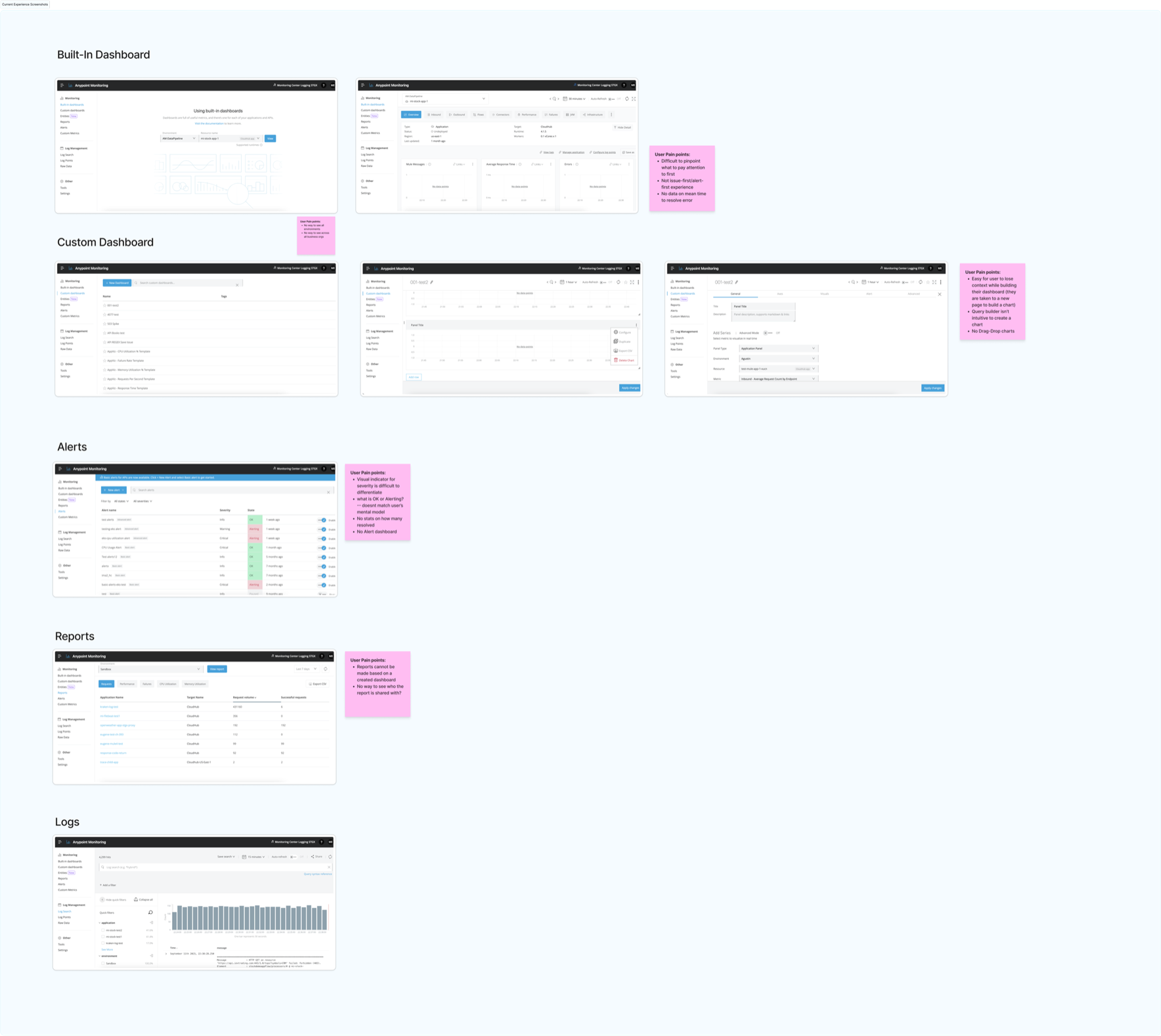
I went through every surface of the product and wrote the complaints down against the screen that caused them. Built-in dashboards gave no sense of what to look at first and no mean time to resolve. Custom dashboards pushed you to a separate page to build a chart, so you lost the dashboard you were building. Alerts used states that did not match anyone's mental model of OK versus alerting. Reports could not be built from a dashboard you had already made.
Collecting them in one place made the pattern obvious. Almost none of it was about missing features. It was about the product asking people to hold context in their head while it moved them somewhere else.
Following a real troubleshooting job
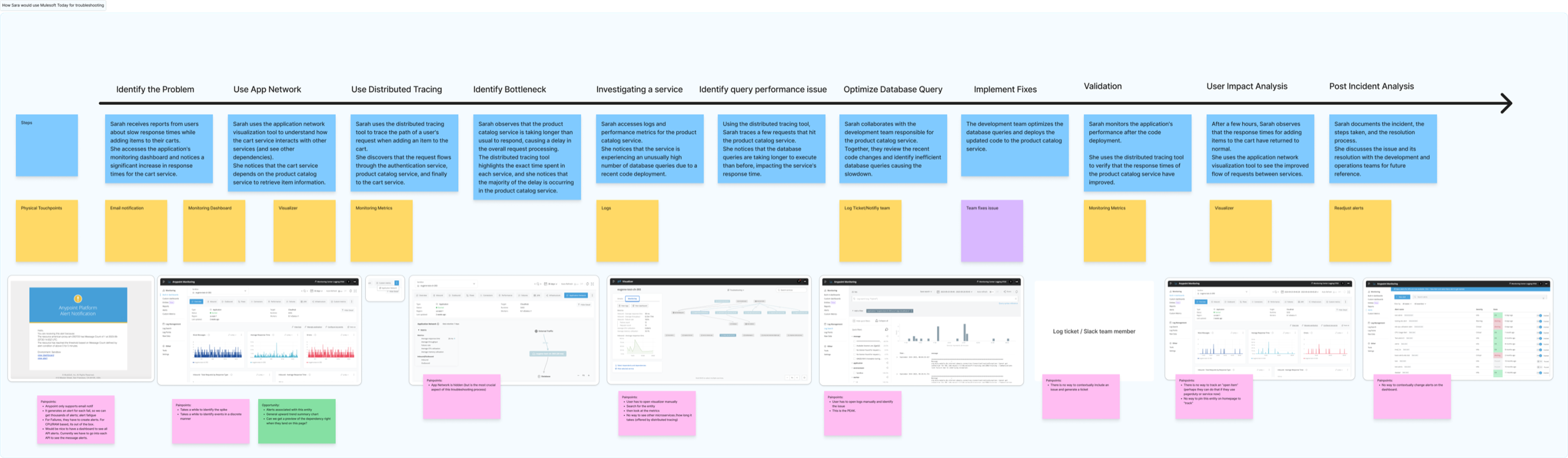
Pain points on their own do not tell you what to build first, so I mapped what an engineer actually does when something breaks, end to end: reports of a slow cart service, tracing the request, finding the bottleneck in the product catalog, optimising the query, deploying, then validating that response times recovered.
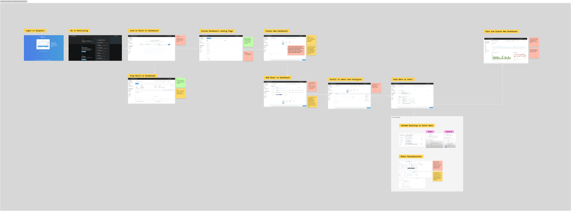
Laid out that way, monitoring is a small part of a much longer loop, and most of the friction sat in the handoffs. I also traced the existing path for creating a dashboard, step by step, which is where the detour to a separate page to build a chart shows up as an actual break in the flow.
Build a chart through smart querying
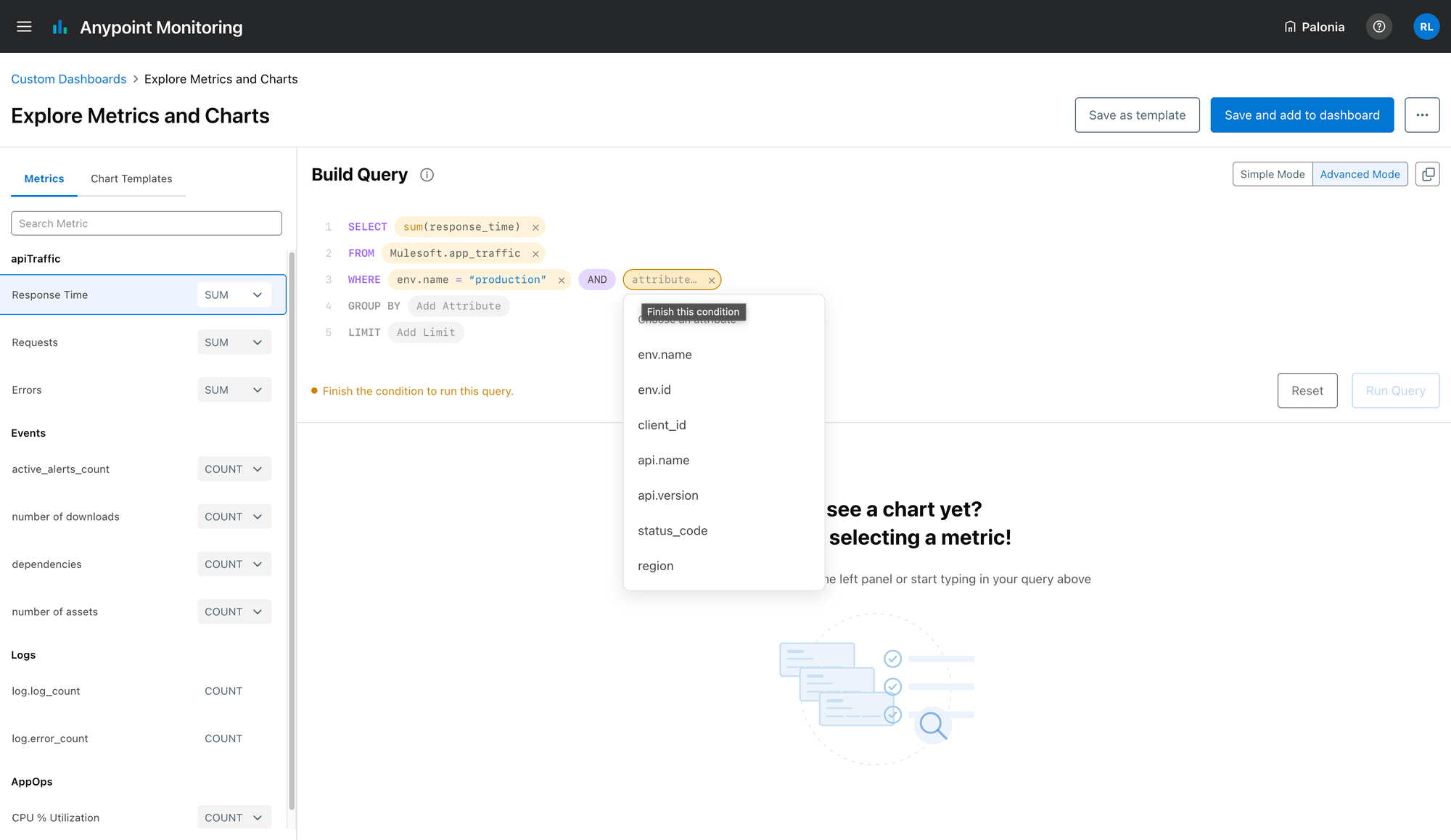
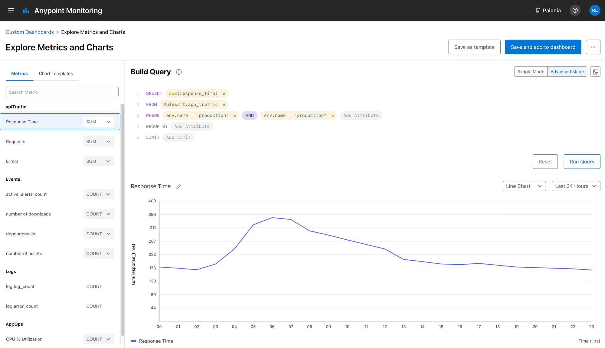
The old query builder assumed you could write the query. The rebuilt one assumes you know what you want to see. It reads as a sentence, one clause at a time, and each clause only offers what is valid at that point: the metrics on this data set, the attributes you can filter by, the operators that apply to the attribute you picked.
Aggregation is a choice on the metric rather than something to remember the syntax for. An unfinished condition says so, in place, and holds the query back from running rather than failing after the fact.
Building the dashboard
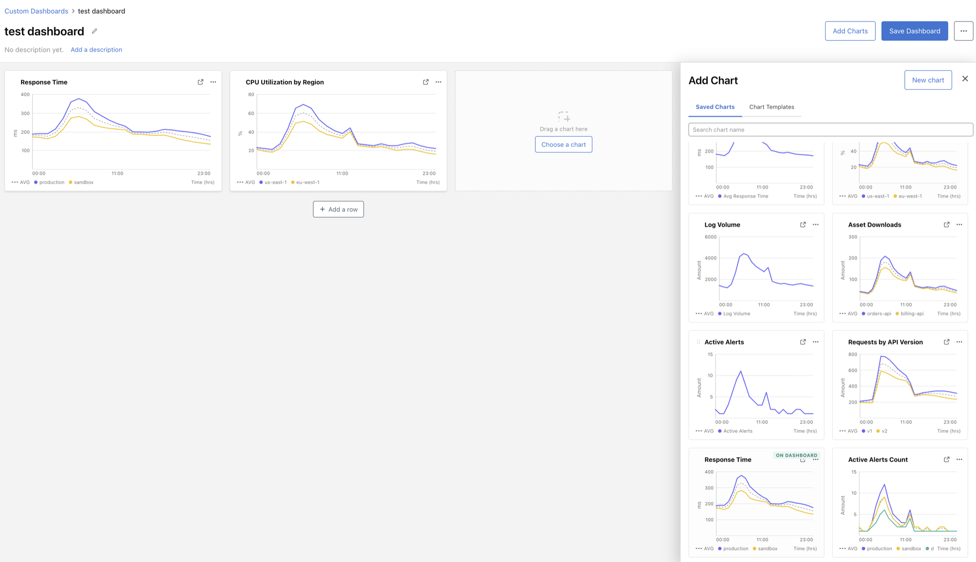
Charts became objects in their own right. You can build one on its own, save it, and drop it into any dashboard later, which is what removes the detour that made people lose their place.
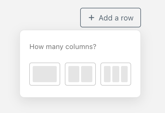
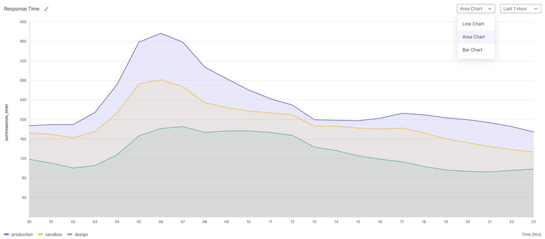
Assembling a dashboard is now laying out rows and choosing how many columns each holds, then filling the slots from charts you have already saved. Chart type is a property of the chart rather than a decision you commit to up front.
Where it landed
The three things holding adoption back are gone. A chart is an object in its own right, so exploring a metric no longer means committing to a dashboard first. The query builder asks for a sentence instead of syntax, and will not run one that is not finished. A dashboard is rows and slots filled from work already done, rather than something assembled by hand each time.
It shipped in support of renewals across five large enterprise accounts. The wider argument underneath it — that monitoring is one step in a troubleshooting loop rather than a destination — became the FY2025 roadmap for a unified DevOps troubleshooting experience.
The audit is the part I would do again first. Writing every complaint against the screen that caused it turned a backlog of feature requests into a single diagnosis, and that diagnosis is what the rest of the work hangs on. Almost none of it was a missing feature.
Outcome
- 5
- Large enterprise renewals supported
- FY2025
- Roadmap shaped by UX vision work for unified DevOps troubleshooting