- AI
- Conversational Design
- Fintech


Rai: RAKBANK's AI assistant
A conversational assistant inside the RAKBANK app that takes a plain-language request and carries it through to a finished banking task.
- Role
- Lead Product Designer
- Duration
- Launched Nov 2025 · relaunched July 2026
- Platform
- iOS · Android
- Year
- 2026
The problem
A customer knows what they want in words: send money to Pakistan, dispute the withdrawal that never dispensed. An app makes them translate that into navigation, the right tab, the right sub-menu, the right form. The gap between the sentence and the screen is where people give up and call the branch.
Rai launched in November 2025 and was rebuilt in July 2026 on what the first version taught us.
Meeting Rai
Rai sits in the bottom navigation on the home screen, so it stays one tap away from anywhere in the app. It also surfaces as a contextual banner, offering to block a card or check a balance on the screens where that offer is actually useful, rather than waiting to be looked for.
It never replaces the phone numbers. Someone whose card is being used right now wants a person, not an assistant, so on the Support screen the numbers stay exactly where they were and Rai's card sits above them as the lighter option: try me first for a quick answer, call if you would rather talk to someone.
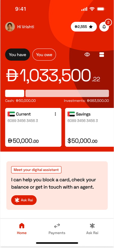
Permanent in the bottom nav, plus a contextual card on the home screen 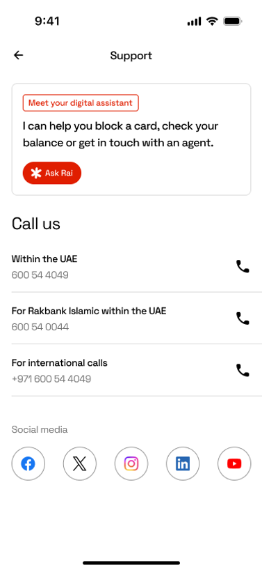
The phone numbers stay first. Rai's card is the lighter option above them
The interface
Two constraints carry the interface. A named greeting turns a blank composer into one obvious question, and a 200 character cap with a live counter keeps each message to a single intent instead of a full complaint.
Every reply ends in one action, not an explanation. Ask to send money abroad and Rai answers with one sentence and a button into the transfer flow, no copy about how international transfers work, because nobody asked for that.
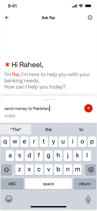
Opens with a named greeting and a composer capped at 200 characters 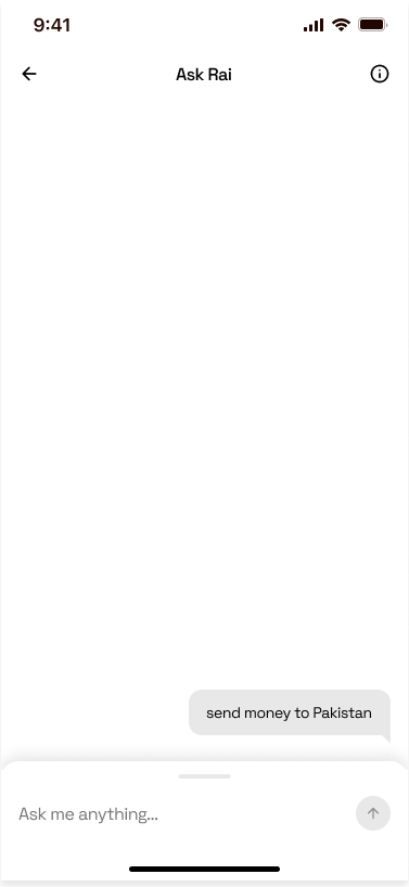
The request goes in the customer's own words 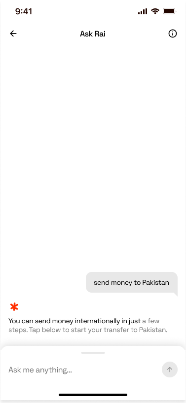
One sentence back, then a button into the transfer flow
Handing over
Some requests are not Rai's to solve. A disputed transaction, a card being used right now, these need a person with the authority to act, not an assistant, so a live agent is never more than one request away. Rai gets a single attempt to help, and the moment the ask turns serious it stops trying and starts connecting instead.
The wait is the real design problem. Status pins to the top of the screen, queue position updates in place, and the thread stays where it is, so the agent picks up everything already said instead of the customer explaining a stolen card twice.
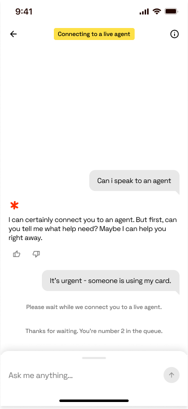
One attempt to help, then it gives way, with queue position kept in view 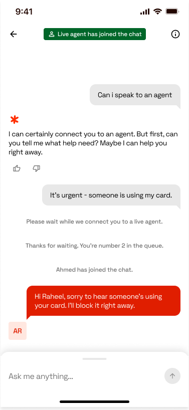
The agent picks up the same thread, so nothing has to be repeated
The Arabic version
Arabic was never a translation pass. An Arabic conversation designer worked the intents alongside the English ones, so the assistant reads as though it was written in Arabic rather than converted into it. Register, phrasing, and how a bank is expected to address someone all shift, and none of that survives a word for word swap.
Every chat component follows RTL conventions. Navigation flips, the customer's messages move to the left and Rai's to the right, and the composer, counter, and send button reverse with them. The fiddly part is mixed text: a Latin name or an amount inside an Arabic sentence still runs left to right, so a line like the greeting has to hold both directions at once without its punctuation drifting to the wrong end.
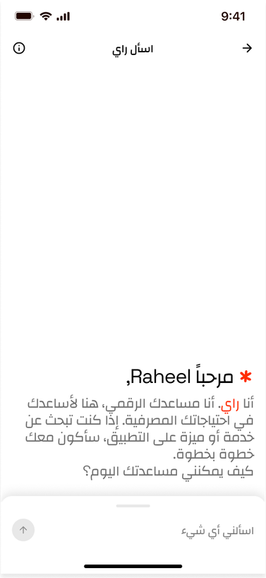
Chrome and greeting mirrored, with the Latin name held inside the Arabic line 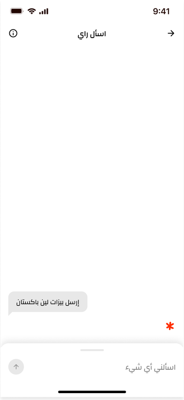
The customer's message sits left, the mirror of the English thread 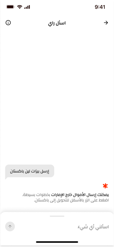
Same one sentence and one action, right-aligned
Conversation design
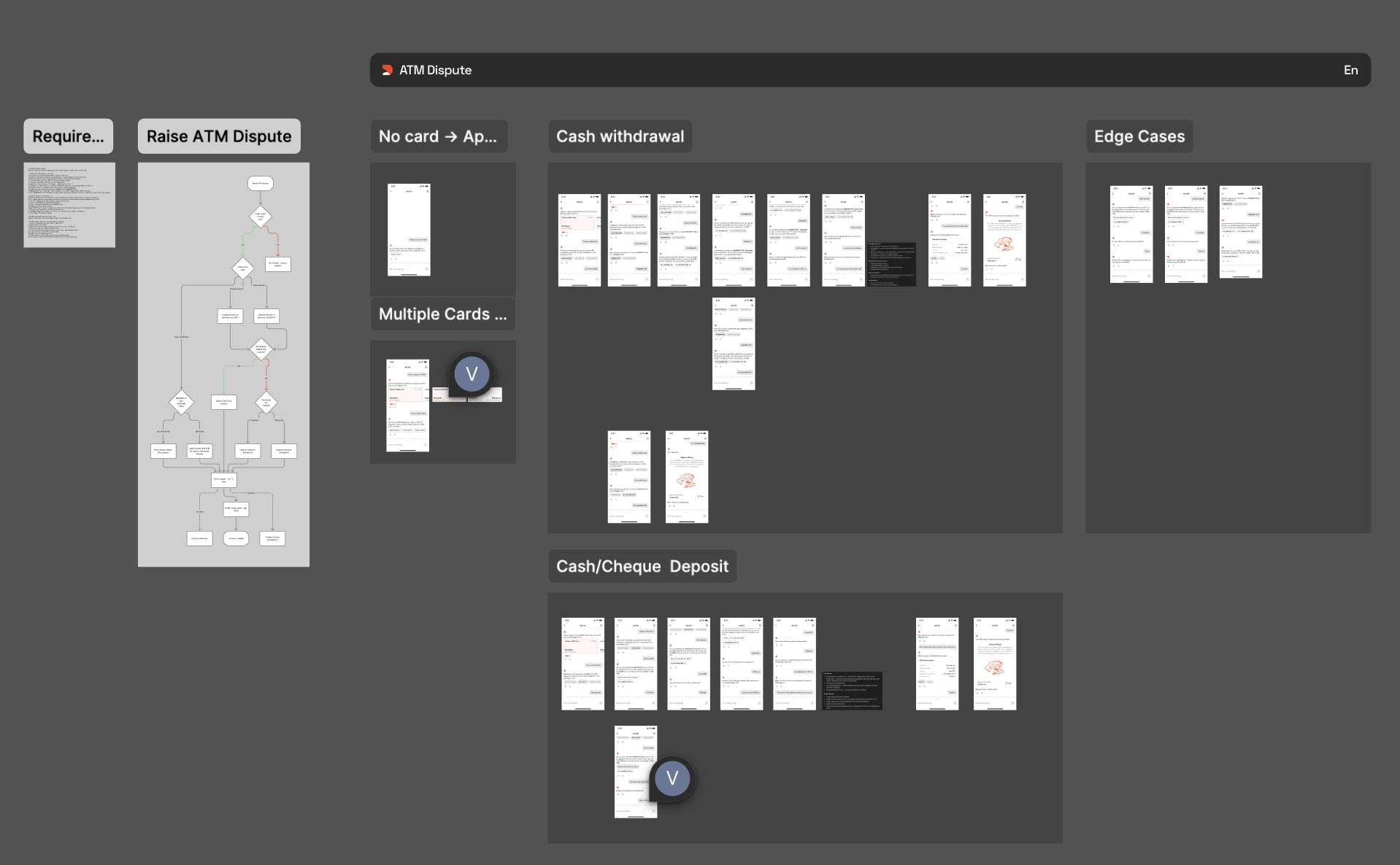
Every intent starts as a flow rather than a script. Requirements first, meaning what the bank must collect to action a dispute, then the decision points, then the branches that fall out of them: no card on file, several cards to choose between, a cash withdrawal versus a cheque deposit.
Edge cases get designed at the same time as the happy path, not after it. That is most of the work. The assistant is only trustworthy at the moment it cannot simply say yes.
Message types
Not every message in an AI chat is a conversation. Splitting them clarified what conversation design owns and where LLM output actually needed guardrails.
| Type | What it is | Owned by | Example |
|---|---|---|---|
| System | Non-conversational UI messages surfacing during chat | Product design | Disclaimers, re-auth prompts, live support banners |
| Static | Fixed steps in micro-flows where no AI is involved | Content design | Predefined form step copy |
| Scripted | Intent-triggered, variable-injected, fixed structure | Conversation design | “Your request for [card] is under review” |
| AI-generated | LLM output in real time, guided by trained scenarios | Conversation design | Open-ended FAQ answers |
Only the bottom two carry conversational rules.
Core rules
| Rule | What we do | Why |
|---|---|---|
| No apologies | Use “unfortunately,” “it seems,” “it turns out” instead of “sorry” | Apology assumes culpability the bank can't legally take on, and distracts from goal-oriented copy |
| Three strikes | Hand to a human agent after three failed intent matches; never ask a user to rephrase more than twice | Repeated failure erodes trust faster than an early handoff does |
| Delay tiers | Under 1.5s no indicator, 1.5–3.5s typing indicator, over 3.5s written acknowledgment | Silence past four seconds reads as failure, not processing |
| Write actions confirm status | “Requested / under review,” never “reversed / done” | The assistant raises the request; it doesn't approve it |
Co-authored with Kristina Hergottova. I owned the message taxonomy and the banking-specific copy rules.
Closing the loop
Every reply carries a thumbs up and down, and that single tap does two jobs: it is the raw signal behind the satisfaction rate in the outcomes below, and the training data that makes each relaunch better than the last. The thumbs alone say what landed but never why, so the detail sits one step deeper, capped at 200 characters like the composer.
The confirmation says where the feedback goes rather than leaving it to vanish. People stop bothering the moment an input feels like it leads nowhere.
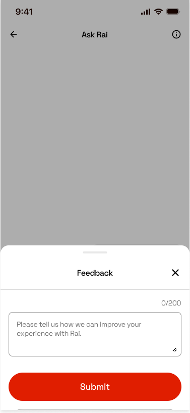
Detail sits one step past the thumbs, capped at 200 characters 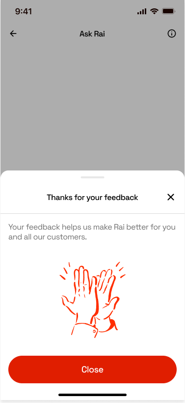
The confirmation says where the feedback goes
The 2026 relaunch
In July 2026 Rai was relaunched on a new visual language with a standardised set of chat components, alongside conversation design patterns for intent structuring, disambiguation, error handling, and escalation to a human agent.
Outcome
- ↓ ~38%
- Call centre volume since launch
- 61.5% → 73.6%
- Containment after relaunch
- ~94%
- Satisfaction rate