Sage
An AI knowledge platform for a UAE bank. Contact-centre agents get a sourced answer mid-call, and the people who own the documents keep those answers right.
Impact
PrototypeIn progress. Both halves are built and clickable: agents ask and check the source, and document owners fix what gets flagged, through a review flow I simplified.
In progress. Built and iterating.
- Role
- Senior Product Designer
- What I owned
- Designed it and built it. Figma for the parts that needed taste, then Claude Code against a DESIGN.md I wrote to keep the generated UI on-system.
- The information architecture of the document library, and the redesign of the maker-checker review flow.
- {{TODO: anything else you owned, for example the retrieval behaviour or the document model}}
- Duration
- 2026
- Platform
- Web
- Tools
- Figma, Claude Code, Next.js, DESIGN.md
An answer an agent cannot check is worse than the folder it replaced.
The problem
Problem
The answer exists, it is just not reachable in time
An agent has a customer on the line and a policy question. The answer is in a document on the bank's portal, which is a repository and nothing more. Finding it means browsing folders by hand, on one of a dozen open screens, while the customer waits.
So the job is not search. It is a correct answer, fast enough to say out loud, and right often enough that agents keep asking.
The design
The system
One half answers, the other keeps the answers right
Agents ask. Product owners and their reviewers own the documents the answers come from. Design only the first half and you get a fast way to repeat whatever the documents say, out-of-date parts included.
The two halves meet in one loop, and the loop is the product.
Ask
An agent asks in plain words and gets a short answer.
Check
Every answer lists its sources, one click away.
Flag
A wrong answer gets a thumbs-down, a reason and the exact sentence.
Route
The flag lands in the document owner's queue.
Fix
The owner edits, and the change goes back through review.
Republish
The corrected version replaces the old one.
For agents
A sourced answer, not a search result
Type the customer's question roughly as they asked it, get a few lines back. The sources sit under every answer, so checking is a click, not a search.
The sourcing is the part I would not trade away. An answer an agent cannot check is worse than the folder it replaced.
Designing for trust
Trust
A wrong answer has to go somewhere
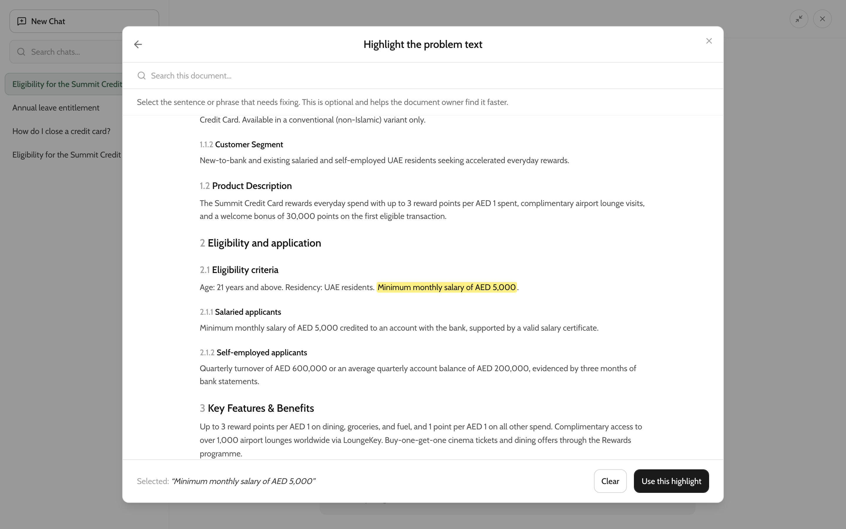
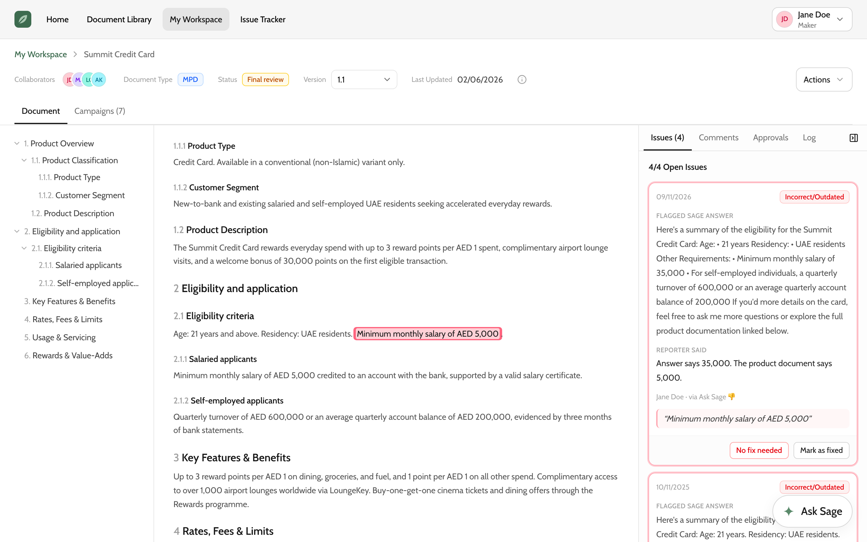
Accuracy is the adoption problem. One confident wrong answer in front of a customer and the agent goes back to the portal for good. So the thumbs-down asks three things: what kind of problem (incorrect or outdated, missing, unclear), which source, and optionally the sentence itself.
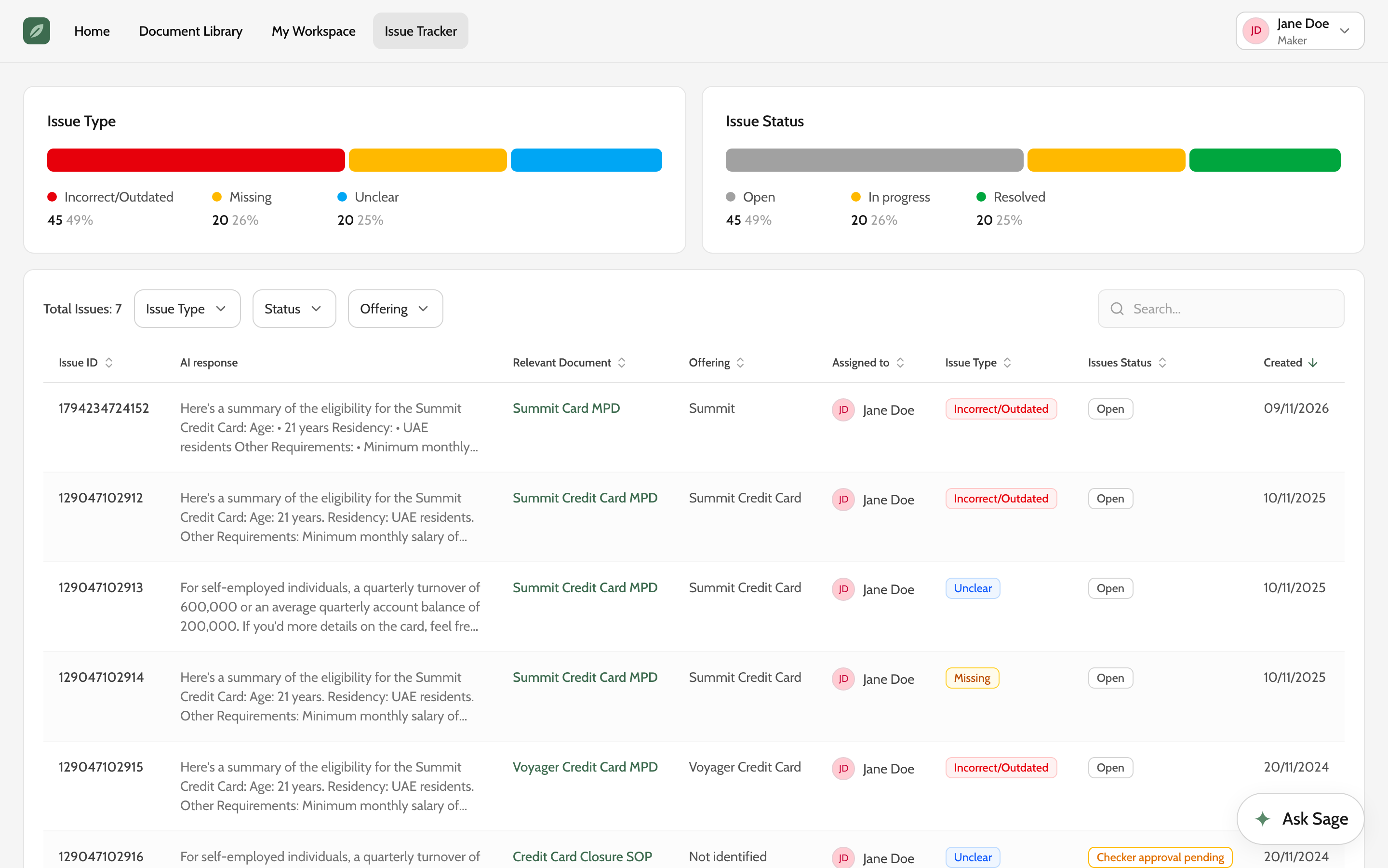
That becomes an issue for whoever owns the document. They land on the page with the sentence marked, the answer that was given and the agent's note, then mark it fixed or no fix needed. The status goes back to whoever raised it.
Information architecture
The library
Built for how people look, and for a library that keeps growing
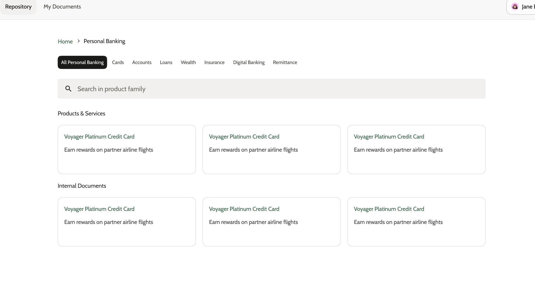
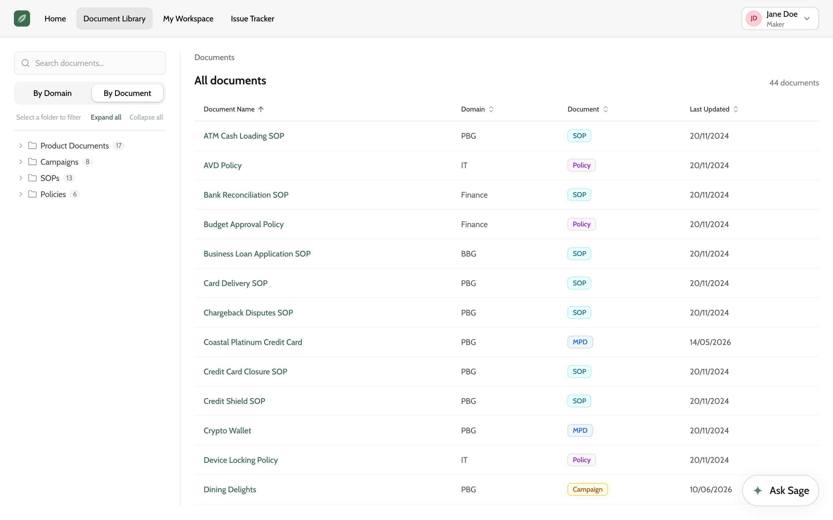
The first library mirrored the org chart: business line, a row of category tabs, then a grid of cards. It works when you already know where a document lives, and it breaks as the library grows. Every new category is another tab, every new document another card to scan.
People look for a document in one of two ways. By where they work: someone in HR does not care about Finance. Or by what kind of document it is: someone checking every live campaign wants Campaigns, whichever team wrote them. The new library pivots one tree between the two, with a count on every branch and a sortable table beside it.
I chose the tree because it scales. The document list will keep growing. A tree takes a new category as one more branch, and a table takes a hundred documents the same way it takes ten. Tabs and cards do not.
Governance
The old review flow
Every reviewer could reject, so drafts went in circles
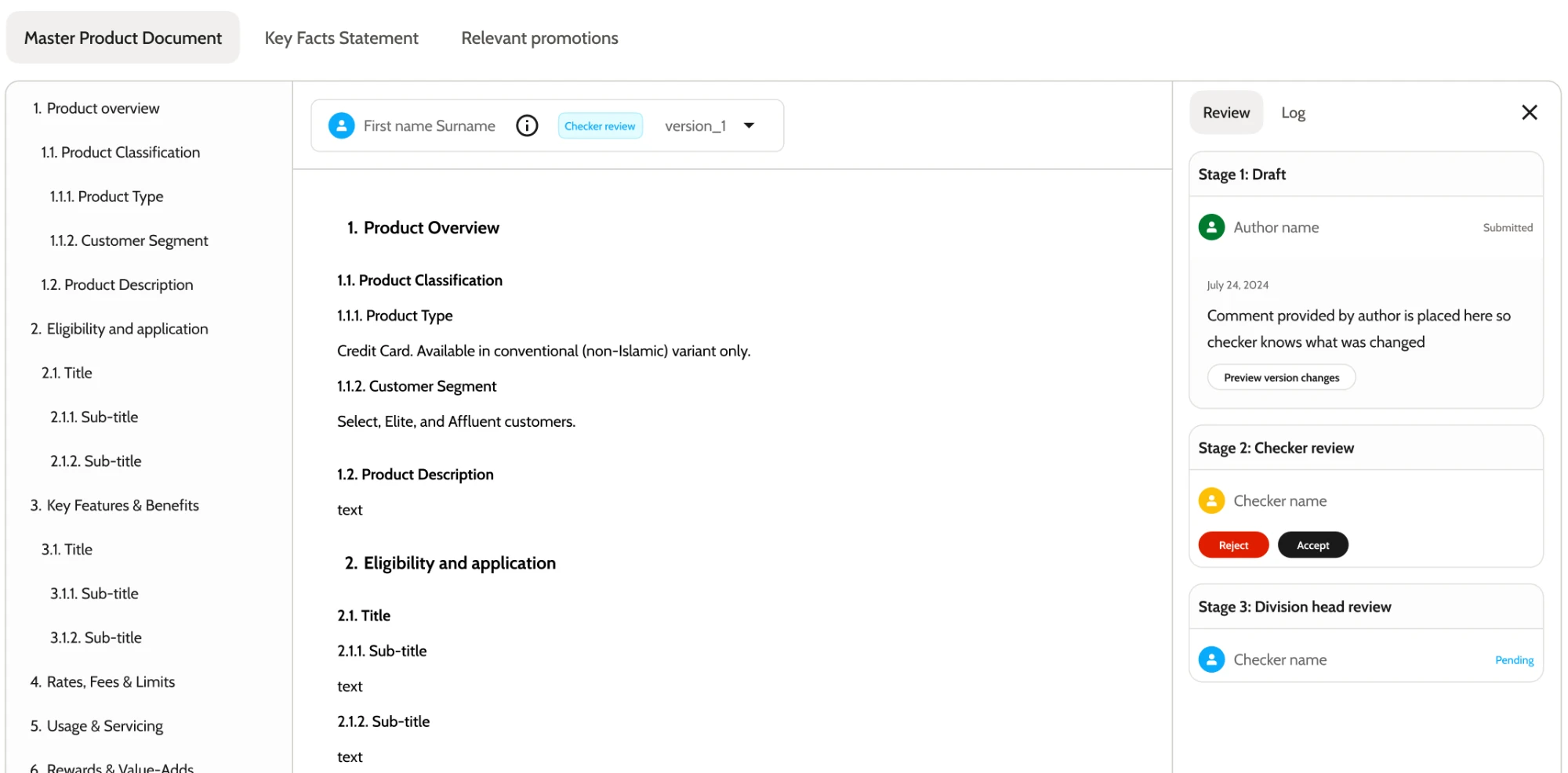
The first review flow gave every checker Accept and Reject at every stage. A rejection sent the draft back, a fix restarted the round, and a document could loop between maker and checkers without anyone knowing what was still blocking it.
The new review flow
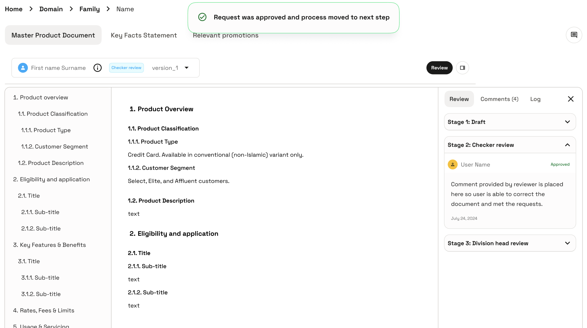
Checkers approve or hold. Only the head of the area rejects.
I took Reject away from checkers. A checker either approves, or leaves a comment and does not. Nothing moves until every assigned checker has approved, then the head of the area gives final approval. They are the only one who can reject, which sends the document back to Draft.
Editing a live document starts a new version. The original stays published until the new one is approved, so agents never lose it mid-fix.
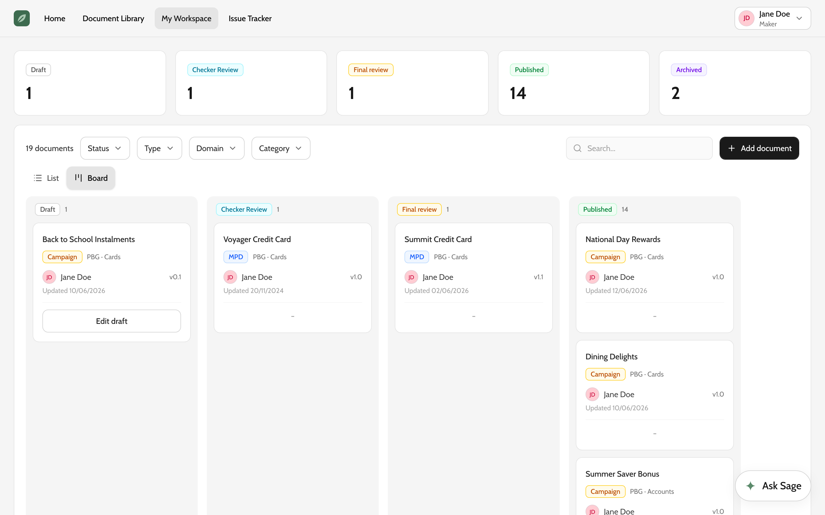
Friction on purpose
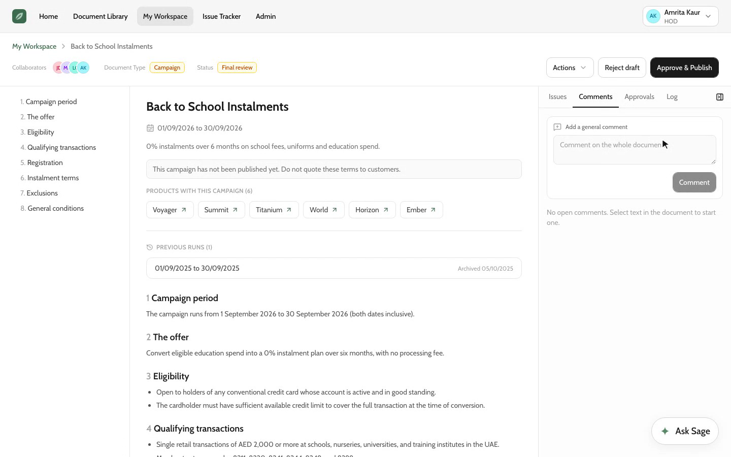
You cannot approve past your own comment
A checker with an open comment cannot approve. The button locks and says why. The maker replies and marks it addressed, the checker resolves it, and only then does Approve come back.
It is deliberate friction. Without it, a comment is a suggestion someone can approve straight past, and the document publishes with the question still open.
The build
How I built it
Figma for taste, DESIGN.md for consistency
Figma first, for the handful of screens where the layout needed judgement. Then a DESIGN.md, then Claude Code building against it.
Generated UI drifts: ten sessions, ten spacing scales. The DESIGN.md writes the system down once, so the model works inside it. A few of its rules, as written:
From the DESIGN.md
| Rule | Why it is written down |
|---|---|
| Never hardcode a hex in a component | Colours come from tokens, so one change reaches every screen. It is also why de-branding the prototype for this page took one file. |
| Tune corners by changing --radius, never per component | One number sets every radius, so a generated card cannot invent its own. |
| A dialog is a frame, not a page | Title and actions stay put and only the body scrolls, so a long form never pushes its own buttons off screen. |
| Vocabulary is load-bearing | Open means read, Review means approval, Report issue means feedback. One word, one meaning, everywhere. |
Looking back
Measure
Adoption is the measure, and accuracy gates it
Success is agents choosing Sage over the portal on a live call. There are no adoption numbers to share yet, so this is how I would show the loop is working: the share of flagged issues closed within a week, whether the same document keeps collecting thumbs-downs after it is fixed, and weekly active agents over time.
- Checkable
- Every answer carries its source
- Routed
- A thumbs-down reaches the document owner
- In progress
- Status
In progress, so no adoption numbers yet. It is here for how I design for trust in an AI tool, and how I build.
What I would do differently
Accuracy first. The interface cannot fix it.
The feedback from the business was blunt. The experience is easy to use, and it is not accurate enough to use. Agents repeat what Sage tells them to a customer, so a wrong answer is not a bad experience, it is wrong information given out by the bank.
Two things were behind it, and neither was the interface. Sage was running on an older GPT model. And the documents underneath were incomplete or out of date, because nobody owned keeping them current. The governance I designed answers the second, but it came after the screens, not before.
Next time I would get accuracy to a usable bar before building anything around it: the right model, tested against real agent questions. And I would push for one person to lead the content, so someone is accountable for getting up-to-date product documents in. Better tooling does not make people upload documents. That part is a people problem first.